The Golden Age of TV Title Sequences
By Virginia Van Dine
Synth music with a hypnotic beat fills up a dark television screen as glowing red lines span and morph before your eyes. Gradually the visual architecture begins to form and letters take shape to present the now iconic show title, Stranger Things. Music, timing, retro vibes, and typography come together to make a mysterious and evocative opening for the show. This title opener is what’s called an opening sequence,[CH1] and TV series opening sequences are having a Renaissance. Actually, Renaissance would suggest a rebirth of the opening sequence artistry, when many title sequences are in fact pushing expectations, techniques, and creative expressions into new directions, unlike what we have seen before.
Various outlets have stated we are in a “Golden”, even “Platinum” age of television. Series are no longer episodic like they used to be, i.e. you can tune in from time to time and not need the continuity of the episodes prior. In contrast, many TV shows now run almost as one long movie, each episode dependent on the previous for the narrative focus of the show. This focus on making high quality television series can be seen in various components that make up a series, including the opening title sequences.
TV title sequences are beautiful right now, and the creation and craft that goes into them must be shared with the TV viewing world. So, with my limited animation and film knowledge (bolstered largely by reading interviews on ArtoftheTitle.com), in conjunction with my love of television and implementation of visual analysis, I give you a brief history of, and opinion piece on, TV opening sequences.
HBO SETS THE BAR
With the development of new design technology like Adobe Creative Sweet in the 1990s, opening sequences began to develop more complex and multi-layered techniques and themesopening sequences. [CH2] With this boom of creative expression, opening sequences took on narrative themes, alluding to major concepts of the show’s story, themes, and characters. , while Aat the same time, these sequences hiding more than they revealed. This is starkly different from earlier opening sequences such as. like Gilligan’s Island where the opening sequence, in song form, tells you the major plot of the series. [CH3]
HBO deserves credit for developing a plethora of artistic opening sequences. The Sopranos and The Wire are early examples of opening sequences created with thoughtful direction and imagery pertinent to the shows’ themes. HBO shows following The Sopranos and The Wire in the twenty-first century [CH4] would become even more influential in terms of technique and overall visual aesthetic.
The Left Overs for example, is perhaps the art historian’s dream opening sequence for its clear art historical references. Open to a scene of fresco-like figures, were it not for their contemporary dress, they could easily be placed in an Italian Renaissance cathedral. What is so interesting about this sequence, is that the creators placed 2D drawings in a 3D space, a technique which you’ve likely observed in other shows as well. The effect is frozen figures who nevertheless, move through the space they’re in. In this case, ascending layers of clouds, harshly juxtaposed with violent, distressed, and sinful humans. The opening sequence pans closely through different groups of figures. At the end, the camera zooms out to reveal the totality of this macabre scene that is both Ascension and Last Judgement. The entire composition is placed within a domed ceiling like one would see above the apse in a church. This opening sequence is brilliant on multiple levels: the theme of the show (no spoilers) is the aftermath of people left on earth after others are mysteriously snatched up into the sky. This sinister yet biblical theme is perfectly rendered.

True Blood, a vampy, dark, and sexy series about vampires in Louisiana, is another noteworthy title sequence by an HBO series. Instead of illustrations, True Blood’s opening sequence implements found images and weaves them together to create a sort of collage and narrative story board. Scenes of sexuality, gore, and superstition within the landscape of the Southern United States paired with a solid song choice make for a memorable opening sequence.
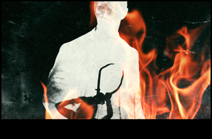
However, as far as HBO show opening sequences go, True Detective is the pinnacle of artistic influence. The opening sequence of season 1 is the product of design directing company Elastic and its Creative Director, Patrick Clair. You’ve likely seen the opening sequence itself or seen its influence in shows like Key & Peele. The particular method Elastic used in creating the imagery for the sequence has been emulated in music videos, movies, as well as other television shows. True Detective’s opening sequence lays out a dark visual feast of decay, pollution, broken people, and violence. To achieve this effect, Elastic used animation, photography, and slowed down footage from the show to allude to the dark and depressing themes of the series. Patrick Clair explains how they used “photographic double exposures, fragmented portraits, created by using human figures as windows into partial landscapes” and how this method “served as a great way to show characters that are marginalized or internally divided.”[1] It’s a beautiful creative concept despite the show’s inherent gloom and doom. Everything about this opening sequence was carefully planned, designed, discussed, and presented as an artistic production.

HBO programming continues to have impressive and deeply emblematic opening title sequences. Elastic has worked on many of these sequences, including the iconic Game of Thrones opening sequence and Westworld’s own very eerie opening. However, it’s not just HBO pushing the envelope of creative expression in this medium. Cable network series and streaming platforms like Netflix and Amazon have also produced some incredible and innovative title sequences using a variety of techniques and media.
ANIMATION & NAILING THE CULTURAL PERIOD
An opening sequence more illustrated than the photography in True Detective, but less painterly in appearance compared to The Leftovers, is the sequence of Mad Men. An iconic show, of an iconic era, this opening sequence was designed to represent the major themes of the show. The company Imaginary Forces was the mastermind behind this sequence which features a semi-silhouetted man falling through a vortex of sky scrapers and 50s-60s era advertisements. The scene is CGI (computer generated imagery). Imaginary Forces used multiple camera angles to cover the fall, so that it appears almost continuous as the man falls past different buildings and ads. Several advertisements had to be created by the artists at Imaginary Forces to fill the space of the sequence. The attention to and reflection of the cultural history of advertising in 1960s New York is masterfully presented.

For TV shows focusing on specific time periods, bringing the viewer into that era of history and its cultural mindset is a necessary, but also difficult task for an opening sequence to achieve. Take for example, the opening sequence for Netflix original GLOW (Gorgeous Ladies of Wrestling), which draws from the real live wrestling program of the 1980s. The show is obviously modern, but it maintains the presentation and feel of the 80s through music, costume, and theme. The company Shynola is responsible for this modern take on a retro era. The opening sequence features women outlined in neon applying makeup, hairspray, and taking it to the mat as they wrestle in the ring. Add the song “Warrior” by Patty Smyth and the result is something wonderfully 1980s, yet technically advanced. How this was achieved was through the use of a device called a rotoscope.[2] This device projects actual footage, in this case real women wrestling (from both the show and from old footage from the 80s GLAM matches), and projects and enlarges the frames which are then outlined. This creates a cartoon animation and composite film sequence at the same time. The result: neon cartoon women doing body slams, graphic trails of neon, and some fantastic 80s typography.
TYPOGRAPHY!
Typography, the style of the printed word. It sounds so simple, perhaps ineffective, but it is hugely important-especially for TV shows. The themes, concepts, and messages of a television series can all be conveyed in the letters that form to present the name of a show. Take Donald Glover’s Atlanta for example. The opening sequence is a series of aerial shots of the city of Atlanta. What makes the opening sequence special is the style and placement of the text “Atlanta”. The A’s on either end of the word are mirror images of one another, with tails that curl out and up, while the letters in between stand solidly and somewhat plainly in comparison. At the beginning of each episode, the text becomes a character, integrated within a specific scene that relates to that episode’s theme. Take for example, a close-up view of a street where the “Atlanta” text appears as paint on asphalt, or liquid from a spilled drink on a table morphs to shape “Atlanta”. It’s simple on the surface, but subtly genius, much like the show.


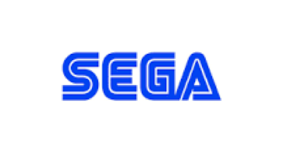
Mr. Robot presents another example of the impact of typography in an opening sequence. SEGA’s iconic typography gets repurposed in this mental thriller about a genius hacker. The creative forces behind the Mr. Robot opening sequence used a retro, computer-themed typography but dyed it bright red and emblazoned it across the opening scene credits. Like Atlanta, the title “Mr. Robot” is incorporated into various scenes at the beginning of each episode. However, the title dominates rather than cohabitates with its backdrop. The scenes are often greyscale and are overpowered by the demanding red typography.

THE IMPACT OF A QUALITY OPENING SEQUENCE
The discussion of typography in opening sequences leads us back to where we started: Stranger Things. Imaginary Forces also worked on this opening sequence, and with the help of the show’s creators, selected the font Benguiat. This font was chosen specifically for its association with paperback Steven King books from the 80s.[3] So much of the show’s appeal is its ability to represent 80s culture. This coupled with the homage to science fiction makes creative decisions such as font is key. The simplicity of this opening sequence also presents the efficacy of type in motion. Animation, typography, and music all come together to make a recognizable opening sequence, which is arguably what creators want most.
TV shows are no longer regulated to just being viewed on the television, they stream on phones, computers, tablets etc. Because of this accessibility, we can watch TV in a variety of places outside the living room. When you’re watching a show on the bus on your way to work, you want to be transported from your morning commute and into the fictitious world inside the screen. Opening sequences are an integral component of this teleportation as they set the tone for the show and pull you into its contents. Created and carefully designed visual material can convey mood, themes, time periods, and culture in a strong opening sequence. So much is considered when making an opening sequence, from music to details in line orientation, that it is a shame not to stop and appreciate the artistry that goes into these sequences. In conclusion, consider not selecting the Skip Intro button on Netflix or going to refill your wine glass during a show’s opening sequence- you could be missing some magnificent art.
[1] Will Perkins, Art of the Title, Interview with Patrick Clair from Elastic, January 14, 2014.
[2] I still don’t fully understand all the technical details of how this rotoscope works. But if you’re curious to learn more, check out the Art of the Title interview with Shynola’s Title Director Richard Kenworthy.
[3] Will Perkins, Art of the Title, Interview with Michelle Dougherty of Imaginary Forces, August 9, 2014.
[CH1]“This is what’s called an opening sequence, and”
[CH2]“opening sequences became more complex”
[CH3]“For example, the opener to Gilligan’s Island tells the audience the entire plot of the series in song form.”
[CH4]Later HBO programming
Links:
https://www.wired.com/2017/03/tv-opening-titles-got-damn-good/
http://www.artofthetitle.com/title/the-leftovers/
http://www.artofthetitle.com/title/true-detective/
http://www.artofthetitle.com/title/mad-men/
http://www.artofthetitle.com/title/glow/

Ginny is a host of the Art History Babes podcast. When she’s not podcasting, she enjoys making pasta, reading, and collecting old records.